Do you want ME to help YOU with your trading?
Video Transcript:
Hello everyone, it’s Dale here, and
today I’d like to do a detailed trade analysis of a trade on the Euro
Futures(6E). What you see before you is the Euro Futures(6E) on a
30-minute time frame. This is where the original analysis of the trade was
made. Let’s first cover that, and then we’ll go into the details, talking about
order flow, order flow confirmation, and how one of our members of our trading
group executed the trade.
Let’s start with the level. It was
a support level based on a volume profile setup—a trend setup. It was a very
clear level because it was based on heavy volumes that formed within this
uptrend. Basically, this is the volume profile trend setup where you look for
significant volume clusters within a trend and then trade pullbacks to them, like
here. This was the reaction to that trade, but there were a couple of things
I’d like to discuss.
The first thing is that there was
another reason for this long level, and the member who was trading it actually
noticed that, which is pretty cool. The thing is, this was a failed level from
the past. As you can see here, there was a heavy volume zone. If I extend the
line like this, you can see that this level failed in the past. The price went
past that strong level. However, if a level fails, it doesn’t necessarily mean
it wasn’t strong or that we made a wrong analysis. It simply means the buyers
were too strong and pushed through. But the level is still there and adds
strength to our new level, which is based on those heavy volumes. So, the level
we have here is based on two things: the volume profile setup here and the fact
that this was a failed short level in the past. That’s the reasoning for this
support level.
Another thing I wanted to mention
is that this red candle that occurred before the level was actually a macro
news candle. It was retail sales macro news, combined with unemployment claims.
Although it wasn’t the strongest macro news, it caused a very strong and
aggressive selloff, making this trade risky. This trade wasn’t taken right after
the news; the price hit the level about 13 to 15 minutes after the news was
released. If it had been right at the time of the news, there would’ve been no
point in taking the trade. But because it was after the news, it was less risky
to take the long from here.
Now, what our member did here was
to place the stop loss a little wider, somewhere in this low volume area.
That’s why he didn’t get stopped out when the price overshot the level a bit
here. He moved the stop loss to this low volume zone instead of the usual place
because of the macro news and the strong selloff, allowing the trade some
breathing room due to the increased volatility, which eventually saved him.
This was very good thinking.
When the market is spiking against
my level, like here, I go to the order flow to see some confirmation that the
level is going to work and that it’s not too risky to take the long trade. I
need to see significant buyers jumping in; otherwise, it would be very risky
for me to enter a long trade from here. Let me now go over to the order flow
and show you what exactly happened when the price reached that support zone.
This is where we delve more into the details.
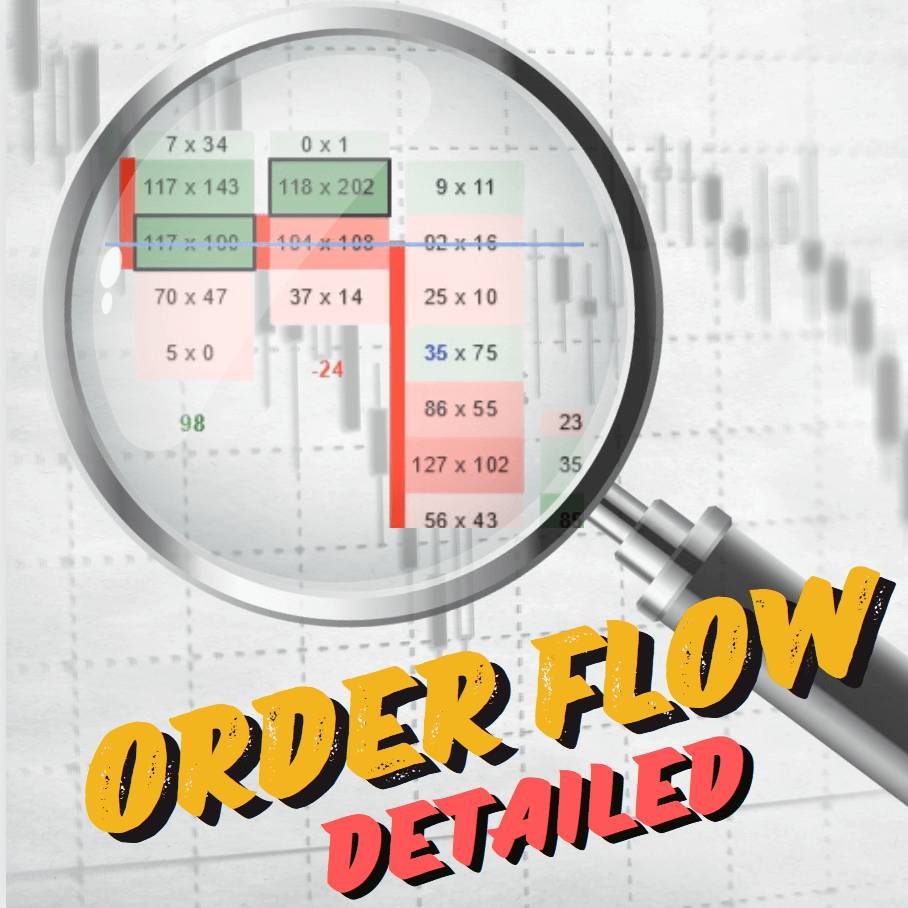
This is the order flow layout that
I use. All the charts show the point where the price hit the level. This is the
long level on this 30-minute chart. This chart is a 5-minute chart, and the
level was here. On this chart, the level was here as well—again, on a 30-minute
chart, but this one is filtered to show only the huge orders. Lastly, on this
chart, the price hit the level. This is a 1-minute chart, and I’ll stop here to
talk about this chart.
Let’s focus on this one. This is a
1-minute line chart, and below that is the cumulative delta. Essentially,
cumulative delta shows the difference between aggressive buyers and aggressive
sellers. I use this chart to look for divergences. Usually, the price and
cumulative delta move in the same direction. If the price goes up, cumulative
delta goes up, and vice versa. But in this case, there was a huge divergence. As
the price was dropping here and hitting this zone, look at what cumulative
delta did—it went up. This means that even though the price was dropping,
buyers were jumping in. The price didn’t initially react, but buyers were
active. The price tends to follow delta, so if buyers start jumping in, the
price eventually turns and goes upward. This divergence alone would be enough
for me to enter that long trade because I see that buyers started to jump in at
the level I wanted to trade from. This is very strong confirmation.
Another confirmation was on the
filtered chart, which shows only the huge orders from big trading institutions,
filtering out market noise. As the price was dropping towards the level, just a
tiny bit below it, a huge order of 119 contracts appeared. Now, when the price
is dropping towards support and a large order appears at the bid, it’s likely a
limit buy order. This is another strong confirmation, indicating that a big
trading institution or trader was waiting at this support with a limit order
and went long when the price reached this zone. That’s another confirmation to
go long from this level.
One last thing—just a little bonus.
If you look at this 5-minute chart showing bids and asks and some other
details, notice the red dotted lines. These show unfinished business, which the
price likes to test. There was a zone here with many unfinished businesses in
the past, which we can call an unfinished business cluster. The price likes to
test them, so as the price was dropping, it tested all the unfinished business
lines in that cluster, tested the last line, and then, if I zoom out, reversed
and went upwards—but only after testing all those unfinished businesses. So, if
you’re in a short trade like this, it’s likely that the price will want to test
all those unfinished businesses if they’re stacked like this, and you can trail
your position accordingly.
Now, let’s talk about take profit.
Let me show you where our member took profit. Switching back to the 30-minute
price action chart, he made a perfect exit. This is where the trade entry was,
where he went long, and where he exited the trade. The reasoning was that this
level was support in the past, and when the price shot past that support, it
turned into resistance. That’s why he exited the trade here.
There’s also something else I
noticed that he might not have been aware of. Let me show you—back to the order
flow. I’ll go full screen with this filtered chart. This is the place where the
price was dropping, and this is the support where he went long. The greenish
line is where he took profit. As you can see on the filtered chart, a massive
order appeared here as the price was dropping. Someone placed a huge order at
this point, indicating that this level was significant in the past and a very
good place to exit the trade. This could have turned the price, especially when
combined with the support becoming resistance setup I mentioned earlier.
This huge volume note and combining
the two factors gives you a very nice place to exit your long trade.
That’s about it for this detailed
analysis. I hope you guys liked it. Let me know if you’d like more detailed
analyses like this one. If you’d like to join us and trade with us every day,
head over to my website, Trader-Dale.com.
If you click on “Trading
Course and Tools” it’ll take you to a page where you can browse my trading
education and custom-made indicators. Here’s the Volume Profile pack, which
will teach you everything about volume profile trading. This is the Order Flow
pack, focusing on day trading with order flow. And the latest one, the VWAP
pack, was released recently and focuses on trading with VWAP and anchored VWAP.
If you scroll down a bit, you can purchase a combo of these packs, which means
you can get all three packs together at a massively discounted price.
That’s about it. Thanks for
watching the video, and I look forward to seeing you next time. Until then,
happy trading!
Hi Dale,
Very nicely explained.
Ask :
Do you also do this with the index futures
Or do you use other graphs for that?
gr
Manfred
Awesome video, very informative!