Do you want ME to help YOU with your trading?
Video Transcript:
Hello
everyone, it’s Dale here. In this video, I’m going to show you three order flow
patterns to spot trend reversals. You can trade this with any trading
instrument that you want. I personally prefer currency futures and indices like
the ES or the NQ.
Regarding
the time frame, what I prefer is fast time frames like 1-minute, 5-minute, 10,
15, or up to a 30-minute time frame. So, we are basically going to be talking
about intraday trading. This is not for position trading—only for intraday
trading.
Alright,
now the software I’m going to use is my custom-made Order Flow for the
NinjaTrader 8 platform. You can use any other software that you prefer; all the
functions should be there, so no worries about that.
Alright,
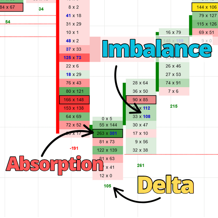
so let’s get started. Let’s start with the first pattern, which is called absorption.
The
first reversal pattern is called absorption. Absorption basically tells you
that either buying or selling pressure is being absorbed. That means if you
look at the footprint chart—the order flow chart—you will see huge volumes both
on the bid and ask.
If
you take a look at this example right here, the price was going upwards, and
then there was a high-volume node with huge volumes both on the bid—that’s
here—and on the ask—that’s right here. Unusually huge volumes, right? And
that’s the absorption.
Those
heavy volumes, in this example, are telling us that buyers were pushing the
price upwards, and we see their aggressive orders on the ask. But at the same
time, at this price level, sellers started to sell aggressively as well. We can
see them here—those are aggressive sellers—and the price stopped moving. That’s
important. With absorption, the pressure—either buying or selling—gets
absorbed. That’s why the price stops moving, and heavy volumes accumulate
either at one price level or across a couple of very close price levels. In
this case, it was just one high-volume area.
So
in this example, this is where the absorption took place, and after that, the
trend changed because the buyers ran out of fuel, sellers took over, and there
was a change of trend. This is the bearish scenario of absorption.
Now
the other picture here shows the bullish absorption. What you can see here is
that the price was going downward. Sellers were pushing the price down, and
then the price stopped here and buyers stepped in. They started to buy, but at
the same time, sellers were selling—but the buyers were buying everything the
sellers had to sell. That’s why the price stopped moving. Sellers were selling,
and at the same time, buyers were buying. The price stops moving, huge volumes
are accumulated at this price level, and eventually, sellers run out of fuel
and buyers take over.
So
that’s absorption.
Let
me show you a couple of examples. What you see here is a footprint chart. I
believe the symbol here is the ES. It’s not too important what the symbol is.
You can see that the price was going upwards, but then there’s this huge
high-volume node with massive volumes on both the bid and ask. It’s important
that the heavy volumes are on both the bid and the ask.
So
again, buyers were buying aggressively, but at the same time, sellers stepped
in and started to sell. That’s why the price stopped, and eventually, buyers
ran out of fuel and sellers took over. There’s the change of trend. That’s
absorption, right here.
As I
was saying, you need to look for huge or unusually large volumes. I don’t have
exact values for each instrument for what constitutes “unusually huge
volumes,” because every session, instrument, and time frame is different.
But if you look at the chart and see what the usual or standard volume is—like
here, or here, or here—then you’ll know when you see something like this, that
it’s unusually large. It’s an unusually huge order or volume cluster.
This
was the bearish scenario. Now let me show you the bullish scenario.
What
you can see here is that the price was dropping, and then a huge heavy volume
cluster formed. In this case, it’s not just at one price level but spread over
a couple of levels. This is absorption—unusually large volumes being absorbed
in this area. Again, sellers were selling, but at the same time, buyers were
buying. The price stopped for a while here, and then there was a reversal.
Alright,
so when you spot absorption, there’s a solid chance the price will reverse
because the pressure is being absorbed and it’s likely that the price will soon
turn and go the other way.
Alright,
that’s the first reversal pattern: absorption.
The
second reversal pattern is a change in delta.
I
should probably explain what delta is before we continue. Delta is the
difference between ask and bid. If you look, for example, at this footprint
here, delta is the sum of ask volume minus the sum of bid volume. If the number
is positive, then the delta is positive; if the number is negative, then the
delta is negative.
In
this particular example, the delta is negative. That means sellers, who show up
on the bid, are more aggressive than buyers. So that’s what delta shows us. My
software displays the delta below each footprint. Other software may do it
differently, but every platform has delta, so don’t worry—it’s a common
feature.
The
cool thing about delta is that price often likes to follow it. What I look for
is a change in delta because the price tends to follow it.
Let
me show you an example.
What
we see here is price going up, but then there’s a footprint with a negative
delta. By the way, this footprint is bullish. You can see it here—the candle
would look like this, and it’s a bullish candle. But the delta is negative,
which is unusual. Usually, with a bullish candle, like this one, the delta is
positive.
In
this case, it’s different, and it signals a change in trend. Sellers stepped
in—they’re more aggressive than buyers—so the trend is likely to change. The
divergence between price and delta is that we are looking at a bullish
footprint, but the delta is negative. That’s the divergence. Basically, price
goes up, delta goes down—that’s the divergence.
Let
me show you a few examples.
Here
you see a little downtrend. In that downtrend, we have negative deltas, which
is normal—when price goes down, delta should also go down. But then we have a
bearish footprint with a positive delta. This tells you that buyers stepped in
and are more aggressive than sellers. A trend change is likely to happen. In
this case, the next footprint also has a positive delta—another sign of
aggressive buyers. So delta is telling you buyers are stepping in and the trend
will change.
Let
me show you one more example.
Here,
the price was going up. We had positive deltas below all these
footprints—everything as it should be. But this is where you should be alert.
We have a bullish footprint, but at the same time, a negative delta. In other
words, aggressive sellers are stepping in. Even though price is going up, delta
is going down. So we have divergence between price and delta, and this is a
sign that a trend will change.
Another
signal comes in the next footprint, which also has a negative delta. Then the
next one also has a negative delta—and here we go—downtrend. So a change in
delta is a powerful tool for tracking trend reversals.
Now,
before I show you the third pattern for spotting reversals using order flow,
let me quickly show you how you can get your hands on my custom-made order flow
software and my order flow trading course.
You
can get it on my website, Trader-Dale.com.
Click the “Trading
Course and Tools” button, and it’ll take you to this page. Scroll down
a bit, and you’ll find the Order Flow Pack, which includes my custom-made order
flow software, order flow video course, and my custom-made Volume Profile
indicators.
But
let’s get back to the third pattern.
The
third pattern is imbalances.
An
imbalance means one side of the market becomes significantly stronger than the
other side—buyers significantly stronger than sellers, or vice versa. When I
say “significantly,” I mean three times or more. That’s how I use imbalance: I
set it to three times or more. You can use different values like four times,
five times—you can set that in the indicator settings. I use 300%, which means
I look for values that are three times or more greater.
Let
me show you an example.
The
imbalances are highlighted in blue—my software does that. One important thing
to know about order flow is that you read the footprints diagonally. For
example, here you compare 18 to 0—that’s how you compare bid and ask. Or
compare 104 to 17. If one of those numbers is three times or more larger than
the other, it gets highlighted in blue. That means, at that price level, either
buyers or sellers are way more aggressive.
For
example, in this case, 104 contracts vs. 17—the 104 is highlighted in blue
because it’s more than three times greater. That means sellers were way more
aggressive than buyers.
In
this example, you can see price moving very aggressively up. All those
imbalances on the ask mean buyers are in control—buyers are way more
aggressive. But then there’s a reversal, and sellers take over—they are now way
more aggressive than buyers. You can tell by the imbalances here.
This
is called a stacked imbalance—three imbalances on top of each other. My
software highlights them in red like this, showing the strength of sellers.
Sellers are dominating—they’re way stronger than buyers. This often happens
when there’s a trend reversal.
Let
me show you a couple more examples.
Here,
price was going up, but if you look at the imbalances, you can see aggressive
sellers were way stronger than buyers. These are selling imbalances, telling
you that aggressive sellers are stepping in. Aggressive sellers drive a
downtrend—like this. So, this is a sign that the uptrend is likely over,
sellers are taking control, and the price will likely reverse.
You
can also notice the delta. As we discussed earlier, the price was going up, but
there were negative deltas. That’s the first sign the trend could change. After
the negative deltas, you see the selling imbalances—and that’s where you should
pull the trigger.
One
more example.
Here
we have a strong downtrend. After the downtrend, we see signs of aggressive
buyers—imbalances right here, stacked imbalance here, and another stacked
imbalance here. Aggressive buyers are taking control, meaning the trend is
likely to change.
This
isn’t just about imbalances. Notice the delta here. At the low of this
reaction, the delta turned positive. Also, we see a sign of
absorption—unusually large volumes on both bid and ask.
So
in this case, we have all three patterns: absorption, change in delta, and
imbalances. And see how beautifully it worked.
One
more thing before we wrap up.
These
reversal patterns work best in significant areas on the chart. For example, if
you see a strong daily high—like this one—and price returns to that area, then
open the order flow software at that zone and look for these patterns. This is
where you want to see them—at significant support or resistance zones formed in
the past.
That
zone could be formed by a price action formation like a pin bar, an important
swing high or low like the high or low of the day, a Volume Profile zone like a
heavy volume zone or daily Point of Control, or it could be VWAP.
Whenever
you see a significant support or resistance zone, look for these order flow
patterns. They’ll tell you and confirm whether that zone is likely to hold and
reverse the trend.
That’s
how you can make the most of these patterns.
I hope you guys liked the video. Let me know what you think in the comments, and I’ll be looking forward to seeing you next time. Until then—happy trading!
Thanks for a very good video. Not too long and not too short. I needed to get work done on some tablets/laptops. When they came back from repair, the downloaded TD trading books were lost. I was happy to be able to replace the lost copies. Thanks again SW