Video Transcript:
Hello
everyone, it’s Dale here, and in this video, I’ll show you how to set up an
Order Flow workspace. I’ll be demonstrating this on my custom-made Order Flow
software, but you don’t need this exact software. You can use any other
software you already have or prefer. However, I recommend using my software
because I think it’s a very good piece of software at a reasonable price.
Anyway,
this is how my Order Flow workspace looks. Many people, when trading with Order
Flow, only have a workspace that looks like this: just one chart. It’s a
detailed chart where they can see all the orders coming in. However, this is
not really what you want when trading with Order Flow. Even though you’re
trading intraday and taking quick scalp trades, you still want to see the
bigger picture. You need to understand the broader context, so a workspace like
this is not sufficient. Let me go back and now show you how I set up my
workspace and how I recommend you set up yours.
We
can divide my screen into two areas: the one on the left, which shows the big
picture, and the one on the right, which shows the details. You can obviously
use more screens for this, but for recording this video and showing you
everything, I’ll be using just one screen. Let me now go through the charts I
have here and explain why they are important.
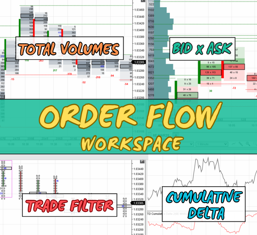
Starting
with this chart, it’s a 30-minute footprint chart that shows the big picture.
On the left side of the chart, there’s a daily Volume Profile, which displays
how volumes were distributed throughout the day. This is important because it
gives me the bigger picture. The footprints you see here are 30-minute
footprints that show total volume, combining both bid and ask. This helps me
identify zones where traders and trading institutions were most active, as well
as where the highest volumes were traded. My software highlights these zones
with darker colors. For example, in this footprint, there are two heavy-volume
zones, and in the previous footprints, you can see similar zones. This allows
me to identify the most important areas at a glance.
Below
that is a very similar chart, but this one doesn’t show all the volumes. It’s
still a 30-minute chart, but it only shows the largest orders. I call this the
filtered chart because it filters out the market noise and highlights only the
biggest orders. If I zoom in, you’ll notice that most cells show zeros, but
occasionally, there are large orders, which are crucial because they often
indicate the intentions of big players or institutions. These single large
orders, such as selling 38 contracts with one market order, are displayed here.
These
two charts—the footprint charts—show the bigger picture. Let’s now talk about
the detailed charts. There’s one more chart I couldn’t fit on this screen. It’s
on another screen and is a simple price action chart with a Volume Profile and
VWAP. This chart also shows the bigger picture and helps me identify trading
levels and understand the broader market context. I typically start my analysis
on this chart before moving to the more detailed charts.
Now,
let’s discuss this chart. I’ll go full-screen so you can see it better. This is
a 5-minute chart that shows footprints with bid and ask. This is especially
useful when the price reaches a strong support or resistance level. It allows
me to see the details of where traders are placing their orders, whether on bid
or ask. For instance, when the price reaches a level I want to trade, this is
the main chart I use. You can also customize the chart’s appearance to resemble
candlesticks, but I prefer the default view with colors, as it indicates
whether buyers or sellers are more aggressive. Green cells show that buyers
were more aggressive (higher volumes on ask), while red cells show that sellers
were more aggressive (higher volumes on bid). This gives me an instant visual
understanding of the market activity.
This
chart also provides additional details, such as Delta values, failed auctions
(or unfinished business), and heavy-volume nodes, which are marked with a black
bracket. These nodes show where the highest volumes were traded within each
footprint. While there are more features, I won’t go into too much detail here
since this video focuses on setting up the workspace.
Finally,
let’s move to this last chart. It looks different from the others because it
shows cumulative Delta. It consists of two parts: the top is a simple 1-minute
chart, and the bottom is the cumulative Delta chart. I use this to identify
divergences between price and Delta. Typically, price follows Delta—if Delta
goes downward, price usually follows. However, when there’s a divergence, such
as price moving up while Delta is dropping, it can signal a potential reversal.
I pay close attention to this chart when the price reaches a strong support or
resistance zone. If I spot a divergence, I take the trade. It’s a simple yet
effective approach.
That’s
my trading workspace. I believe you can easily replicate it on your own, even
if you’re not using my custom-made Order Flow software. However, if you have my
software and are a member of our trading course, our tech support team can set
up this exact workspace for you in no time.
If
you’re interested in joining us or getting my custom-made Order Flow software,
visit my website at Trader-Dale.com.
Click the “Trading
Course and Tools” button to find the Order Flow pack, which includes
the Order Flow video course, my custom-made Order Flow software, and
custom-made Volume Profile software. You’ll also get free tech support to
install everything for you, so you can start trading immediately. If you’re
interested in day trading with me and other prop firm traders daily, click the
“FTA”
button, which stands for Funded Trader Academy. There’s a video there
explaining everything in detail, and you can book a one-on-one call to see if
it’s the right fit for you.
Thanks for watching, and I’ll see you in the next video.