Have you ever looked at a chart and had no idea whether the price was about to go up or crash down? You are not alone. Most traders spend years adding more indicators to their charts, hoping one of them will finally give them the answer. The truth is, the answer was always right there in front of you, written in the price itself. In this article, you will learn how to read price action the right way by understanding exactly what buyers and sellers are doing at every moment on the chart. No indicators. No complicated tools. Just a simple, repeatable method that relies on four key formations. By the end, you will be able to look at any chart and have a clear, logical reason for whether the price is likely to move up or down. I draw on years of active trading experience to break this down as simply as possible, so whether you are just starting out or have been trading for a while, this guide will give you something useful to work with right away.
Table of Contents
SUMMARY IN 5 POINTS
- Price direction is determined by who is stronger: buyers or sellers.
- A strong rejection means one side took complete control and reversed price sharply.
- A weak rejection signals that one side tried to push but lacked the strength to follow through.
- Fair Value Gaps show areas where aggressive buying or selling happened in a hurry.
- Stop-loss clusters reveal price targets the market is almost certain to test.
Why most traders read charts the wrong way
Most people who start trading do the same thing. They open a chart, add an RSI, maybe a moving average or two, draw a few lines, and then wait for the indicators to tell them what to do. This approach has a major flaw: every single indicator on your chart is calculated using past price data. By the time an indicator gives you a signal, the price has already moved. You are always one step behind.
Reading price action directly is different. Instead of looking at a formula derived from price, you are reading price itself. You are asking a much more powerful question: what are buyers and sellers actually doing right now? When you can answer that question, you do not need any indicator to tell you where the price is going. You can see it unfolding in real time.
What price action actually tells you
The method covered in this article uses four formations that appear on every chart, across every market, and on every time frame. These four formations are not magic patterns. They are logical footprints left behind by real buyers and sellers making real decisions. Once you understand the logic, the chart starts to speak a language you can understand.
The skill is not in memorising patterns. It is in comparing who has more strength: the buyers or the sellers. That comparison is everything. Every time you look at a chart using this method, you are essentially asking one simple question: who is winning the battle right now, and who is losing? When that answer is clear, you have a reliable directional read on where price is likely heading next. And when the answer is not clear, that information is just as valuable, because it tells you to wait until the picture sharpens before making any decisions.
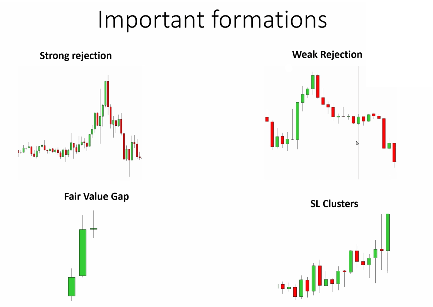
The four formations that tell you who is in control
Before going into each formation individually, it helps to understand why they work. Every candle on a chart represents a battle between buyers and sellers. Sometimes one side wins decisively. Sometimes neither side wins and the battle continues. These four formations are simply the different outcomes of that ongoing battle. They show you who is winning and by how much.
A quick overview before we dive in
Here is a summary of all four formations before we break each one down in detail. Think of this as your reference map.
v | Strong rejection Price turns sharply and aggressively. One side completely overwhelmed the other. |
~ | Weak rejection Price turns slowly and with hesitation. One side is losing strength but the move is not convincing. |
^ | Fair Value Gap A gap caused by aggressive, one-sided movement. Tells you a dominant side took over rapidly. |
# | Stop-loss clusters Zones where many stop orders are stacked. The market is strongly attracted to these areas. |
In a real chart, you will rarely see just one of these. You will see several of them together, and your job is to add them up and decide which side has more evidence in their favour. That is the core of this method. The sections below will show you exactly how each formation works, what it looks like on a chart, and how to use it to build your directional read.
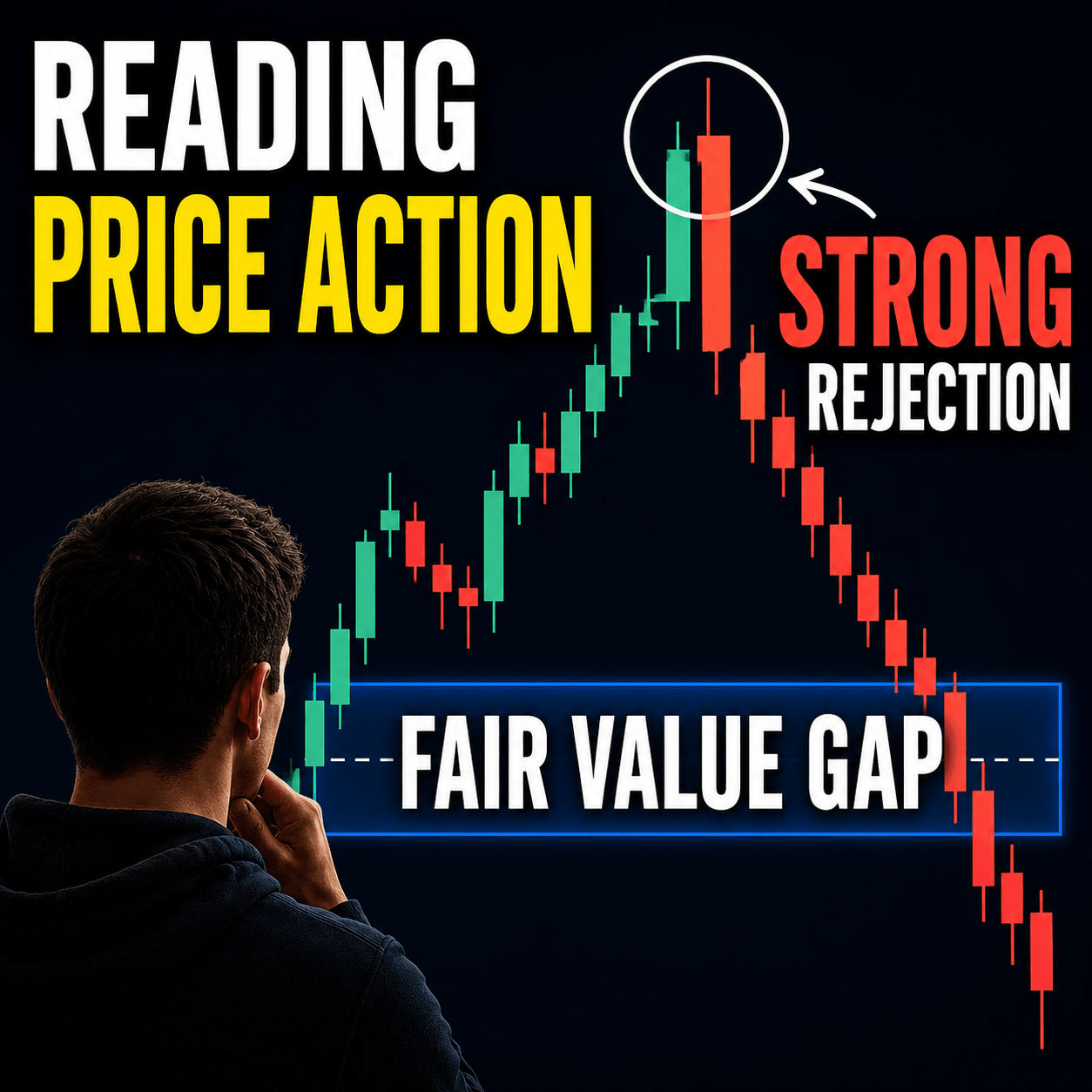
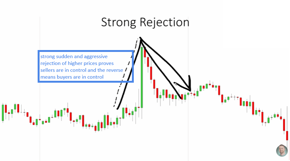
Strong rejection: the clearest sign of dominant players
A strong rejection is exactly what it sounds like. Price moves in one direction, and then it suddenly and aggressively reverses. The key word is suddenly. That sudden turn is what separates a strong rejection from every other kind of price move.
Think of it this way. Imagine buyers are pushing the price higher, candle after candle, moving up steadily. Then, out of nowhere, sellers step in with full force and drive the price back down in a very short time. That is a strong rejection of higher prices. It tells you that sellers were not just present, they were aggressive and willing to defend that price level with conviction.
The same logic works in reverse. If price is falling and then suddenly reverses upward with force, that is a strong rejection of lower prices. It means buyers stepped in aggressively and overwhelmed the sellers.
How to identify a strong rejection on your chart
When you see a strong rejection on your chart, ask yourself: what is being rejected? If higher prices are being rejected, that points to sellers being in control. If lower prices are being rejected, that points to buyers being in control. This single question can often give you enough directional bias to make a clear decision about where price is likely heading.
What makes this formation so useful is that it gives you a clear read on the strength of whoever caused it. A strong rejection does not come from a weak, uncertain player. It comes from a player who had enough size and conviction to flip the direction of price almost instantly. That is meaningful information because it tells you that the side causing the rejection is serious, well-funded, and in control of that price area.
A common mistake beginners make with rejections
A common mistake beginners make is assuming that every sharp candle is a strong rejection. It is not. The reversal must happen from a swing point and then lead to a meaningful continuation in the opposite direction. If price reverses sharply but then just drifts sideways, the rejection may not have had the follow-through needed to confirm it as a true sign of strength. Context matters enormously here. Always look at what happened before and after the rejection, not just the reversal candle itself. A rejection that is followed by a continued move in the reversal direction is a confirmed signal. One that fizzles out immediately is far less reliable.
What you see | What it means | Direction signal |
Strong rejection of higher prices | Sellers are dominant and aggressive | Price likely to fall |
Strong rejection of lower prices | Buyers are dominant and aggressive | Price likely to rise |
Weak rejection: spotting a side that is running out of strength
While a strong rejection is a sharp, decisive reversal, a weak rejection is a slow, uncertain one. The price turns, but it does so gradually, without any real force behind it. There is no sudden flip. There is no aggressive takeover by the other side. The turn is hesitant, almost like the price is dragging its feet.
A weak rejection is not just a small price move. It is specifically about the quality of the reversal. A sharp reversal, even a small one, can be a strong rejection. But a slow, grinding turn, even if it eventually goes far, starts as a weak rejection. The key signal is in how quickly and decisively the turn happens.
Why weak rejections are an early warning signal
Here is why weak rejections matter. When a side produces a weak rejection, it tells you that they are losing conviction. Buyers are attempting to push higher, but they cannot. The reversal is slow because sellers are not yet fully in control, but buyers are clearly struggling. That kind of weakness often precedes a larger move in the opposite direction once sellers finally step in with full force.
Think of it like a tug of war. A weak rejection is when one team is clearly losing but has not let go of the rope yet. They are still holding on, but they are being dragged. Eventually, the stronger side wins. A weak rejection is your early warning signal that one side is about to lose that battle. On its own, it may not be enough to act on. But combined with other formations pointing in the same direction, it becomes a meaningful piece of evidence.
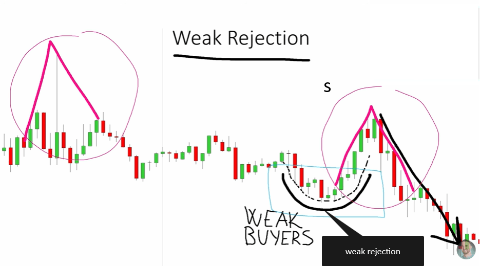
A weak rejection looks like a slow, curved turn rather than a sharp snap. It signals that one side lacks conviction.
Combining weak and strong rejections for a clearer read
When you combine a weak rejection with a strong rejection on the same chart, the picture becomes very clear. For example, if you see a weak rejection of lower prices (buyers trying to push up but failing to do so convincingly) followed by a strong rejection of higher prices (sellers aggressively taking over), you have both a sign of weak buyers and a sign of strong sellers. That is a powerful combination pointing to a drop in price. The chart is telling you two things at once: the buyers are struggling, and the sellers are in full control. That kind of agreement between formations is where your highest-confidence reads come from.
Fair Value Gaps: measuring aggression in the market
A Fair Value Gap, or FVG, is a concept that originally comes from Smart Money Concepts trading. In that framework, traders use it as a support or resistance zone. In this method, however, we use it differently: as a measure of aggression. A Fair Value Gap tells you that one side moved the price so fast and so forcefully that they left a gap in the price structure behind them.
What a Fair Value Gap looks like and why it forms
To understand this visually, a Fair Value Gap is a three-candle formation where the first and third candles do not overlap with the body of the middle candle. This happens when price moves so quickly in one direction that there is no clean two-way trading happening. One side simply dominated and left a gap. It is the chart’s way of recording the moment when one side completely overpowered the other without much resistance at all.
A bullish Fair Value Gap is left by aggressive buyers. It shows that buyers were in such a rush to get in that they pushed price up without any real resistance from sellers. A bearish Fair Value Gap is the opposite: aggressive sellers pushed price down so fast that buyers did not even get a chance to slow them down. In both cases, the gap is evidence of dominance, not just movement.

Bullish Fair Value Gaps signal aggressive buyers. Bearish ones signal aggressive sellers. Count them and compare.
How to use Fair Value Gaps to determine price direction
The more Fair Value Gaps you see on a chart pointing in one direction, the clearer the picture becomes. If you see two or three bullish Fair Value Gaps and no bearish ones, it is a strong sign that buyers have been aggressive throughout that section of the chart. If you see multiple bearish Fair Value Gaps, sellers have been the dominant force. The most powerful use of Fair Value Gaps in this method is to compare them across the chart. Look at the recent price structure and count how many bullish Fair Value Gaps you see versus bearish ones. If one side clearly has more, and if the other formations like rejections also confirm that side, you have a high-confidence read on where price is likely going next.
Type of Fair Value Gap | Who caused it | What it signals |
Bullish Fair Value Gap | Aggressive buyers | Strong buying pressure. Price may continue upward. |
Bearish Fair Value Gap | Aggressive sellers | Strong selling pressure. Price may continue downward. |
Stop-loss clusters: where the market is drawn next
Every trader who enters a position places a stop-loss somewhere. Most of the time, traders place their stop-loss orders just below swing lows if they are buying, or just above swing highs if they are selling. This is a very common and logical thing to do. The problem is, when millions of traders do the same logical thing, they all end up putting their stop-loss orders in the same general area. Those areas become what are known as stop-loss clusters.
How to find stop-loss clusters on any chart
A stop-loss cluster is simply a zone on the chart where a large number of stop-loss orders are sitting, waiting to be triggered. Because stop-loss orders are executed as market orders, when price reaches that zone, it creates a sudden burst of activity that pulls price through that level quickly. That is why moves into stop-loss clusters tend to be sharp and fast.
To find stop-loss clusters on your chart, look for swing points: the small peaks and valleys that form naturally as price moves. Traders place their stops just below these swing lows and just above these swing highs. When multiple swing lows are clustered at a similar price level, or when multiple swing highs are close together, you have a zone where a large number of stops are stacked on top of each other. That is your cluster. Drawing horizontal lines from each swing point is the easiest way to make these clusters visible, especially when you are still learning to spot them naturally.
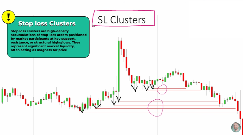
Drawing lines from swing lows reveals where stop-loss clusters sit. The market is strongly attracted to these zones.
Why the market seeks out stop-loss clusters
Once you identify a stop-loss cluster, you should expect price to test it. The market does not avoid these areas; it seeks them out because they represent pools of liquidity. Large players in the market need liquidity to fill their own orders, and stop-loss clusters provide exactly that. When a cluster is combined with a strong rejection or a bearish Fair Value Gap above it, the case for price moving down into the cluster becomes very strong. You are not just seeing one signal, you are seeing the same story being told by multiple formations at once.
When you are starting out, it helps to physically draw lines on your chart from each swing point. This makes the clusters visible and easy to spot. After enough practice, you will begin to see them without needing to draw them, but there is no shortcut to that stage. The drawing is part of the learning process and an important one at that. Do not skip it in favour of trying to eyeball clusters from memory. The act of drawing them trains your eye over time.
Putting it all together: reading a real chart
Now that you understand each formation individually, it is time to see how they work together. In a real chart, you will rarely have just one signal pointing in a single direction. What you will have is a combination of signals, some pointing up and some pointing down. Your job is to count them up and determine which side has more evidence. This is the core question you should always be asking: do I see more signs of aggressive buyers or more signs of aggressive sellers?
A worked example: when sellers clearly dominate
Here is an example of how this looks in practice. Suppose you are looking at a chart and you notice the following formations all appearing in the same area:
v | Two bearish Fair Value Gaps Sellers have been moving aggressively. Strong evidence of selling pressure. |
v | One strong rejection of higher prices Sellers stepped in and reversed price sharply. Another sign of seller dominance. |
~ | One weak rejection of lower prices Buyers tried to push price up but failed to do so convincingly. Sign of weak buyers. |
# | A stop-loss cluster below current price A pool of liquidity sitting below that the market is likely to seek out. |
When you add all of this up, the picture is clear. Sellers are dominant. Buyers are weak. And there is a liquidity target sitting below current price. In this scenario, the probability strongly favours price moving downward. You have four separate formations all telling the same story, and that agreement is exactly what you are looking for.

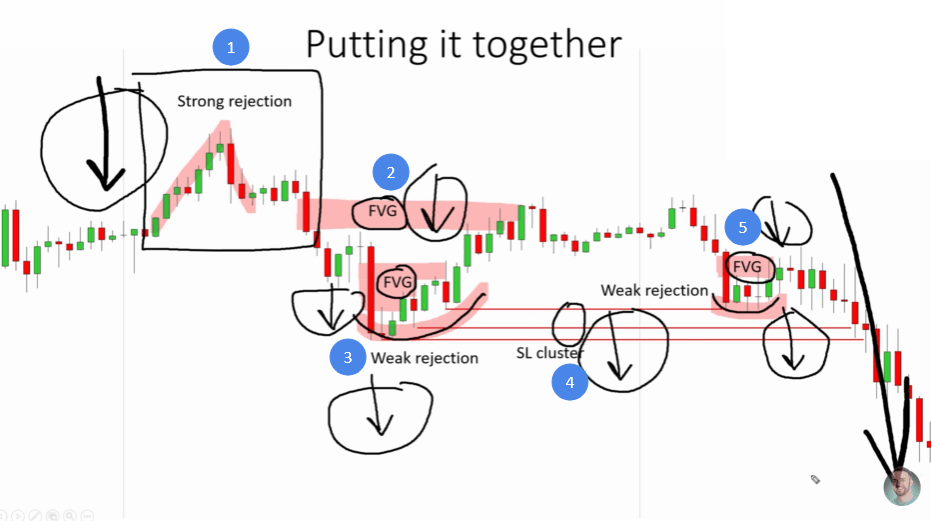
All four formations working together on a single chart. When they all point in the same direction, the signal is at its strongest.
What to do when the evidence is mixed
On the flip side, if you had two bullish Fair Value Gaps, a strong rejection of lower prices, and no bearish formations, the probability would strongly favour a move upward. The method is the same regardless of direction. Count the evidence. Compare both sides. Let the weight of the evidence guide your read.
It is important to be honest with yourself when the evidence is mixed. Sometimes you will look at a chart and find two signals pointing up and two pointing down. That is not a clear read on price action, and the right response is to do nothing until the picture becomes clearer. Patience is not a weakness in trading. Waiting for a clear picture is often the most disciplined thing you can do. Not every chart will give you a clean, obvious answer. Part of developing this skill is learning to recognise when the answer is clear and when it is not, and acting accordingly.
Conclusion and FAQ
Reading price action is one of the most transferable skills in trading. Once you understand what strong rejections, weak rejections, Fair Value Gaps, and stop-loss clusters are telling you, the chart stops feeling like a random series of candles and starts telling a clear story. That story is always the same: buyers versus sellers, strength versus weakness. Your job is simply to figure out who is winning. The four formations in this article give you the tools to do exactly that. The next step is practice. Open a chart, find the formations, and start comparing buyer strength against seller strength. Do it enough times, and reading price direction will start to feel natural rather than guesswork. The more charts you study, the faster your eye develops, and the clearer every chart will become.
FAQ
Can this method work on any time frame or market?
Yes. These four formations appear on every time frame from a one-minute chart to a weekly chart, and they work across all liquid markets including stocks, forex, indices, and crypto. The underlying logic of buyers versus sellers is universal.
How many formations do I need before I take a trade?
There is no fixed number, but the more formations that align in one direction, the stronger the case. Ideally, you want at least two or three formations pointing the same way before you start leaning toward a directional read. One signal alone can be misleading.
Does knowing where price is going tell me where to enter and exit?
Not directly. This method tells you the likely direction of price, which is the first and most important piece of the puzzle. But entry points, stop-loss placement, and take-profit levels require a fuller trading strategy built on top of this directional read.
NEXT STEPS:
Want to go beyond direction and learn a complete trading strategy from entry to exit? Visit trader-dale.com and explore the full trading course and tools. |