
If you have ever opened a charting platform and stared at the volume tools available, wondering which one to actually use, you are not alone. There are at least three different ways to look at volume in trading, and they do not all show you the same thing. Some measure when volume happened. Some estimate where it probably happened. And one shows you exactly where it happened, at the precise price level, without guessing.
This article breaks down the three main volume tools: the standard Volume Up/Down indicator, Market Profile, and Volume Profile. You will learn what each tool actually measures, how they differ from one another, and which one gives you the most useful picture of where buyers and sellers were genuinely active in the market.
By the end of this guide, you will have a clear understanding of why these tools exist, when each one might mislead you, and why Volume Profile has earned its reputation as the most reliable of the three. Whether you are new to volume analysis or just trying to sharpen how you read charts, this breakdown is designed to make things simple and practical.
Table of Contents
Summary in 5 Points
- Standard volume indicators show you when heavy volume occurred, not where on the price scale it happened.
- Volume Profile shows you volume at each price level, which is far more useful for identifying key zones of activity.
- Market Profile does not use real volume data. It estimates volume based on how long price spent at a given level.
- Volume Profile and Market Profile can look similar at first glance but can give very different readings at critical price areas.
- When you have the choice, always use Volume Profile over Market Profile. It shows actual traded volume, not a guess.
What Is a Volume Indicator and What Does It Actually Tell You?
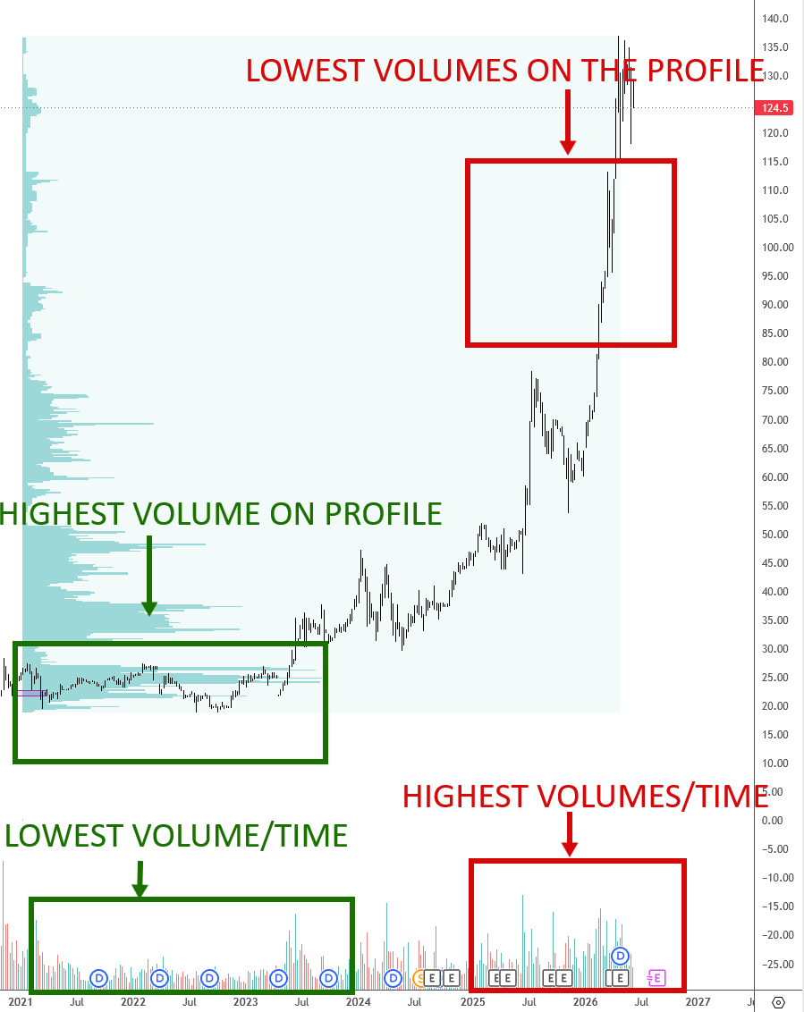
Before comparing tools, it helps to understand what the most basic volume indicator does. The standard volume indicator — sometimes called the Volume Up/Down indicator or just the volume histogram — appears at the bottom of most charts by default. Each bar represents the total volume traded during a single candle. Green bars usually mean the candle closed higher, and red bars usually mean it closed lower. Bigger bars mean more volume was traded in that candle’s time window.
This is volume measured at time. The indicator is telling you: during this specific minute, hour, or day, this many contracts or shares were traded.
When Volume at Time Is Useful
There are situations where knowing when volume spiked is genuinely helpful. A sudden volume spike at the open of the New York session, for example, can tell you that institutional activity is picking up. A sharp volume spike during a news release tells you that a macro event triggered a wave of buying or selling. These are moments where volume at time gives you a useful signal.
However, here is the limitation: you usually already know when those events happen. Session opens are predictable. Major news releases are scheduled. So a spike in volume during those windows is not exactly surprising information. What the standard volume indicator cannot tell you is at which price level all that volume was concentrated. Was the heavy buying happening at 4,350? At 4,380? You cannot know from a volume histogram alone.
The Core Limitation
Imagine two candles with identical volume. One is a long-bodied candle that swept through twenty price levels. The other is a small-bodied candle that barely moved. The volume histogram shows the same bar height for both. It tells you the same amount of volume was traded, but it tells you nothing about where on the price axis that volume landed. For traders trying to identify support, resistance, and zones of institutional activity, that is a significant blind spot.

What Is Volume Profile and How Is It Different?
Volume Profile is a tool that flips the entire concept on its side — literally. Instead of showing volume as bars running along the bottom of your chart in time sequence, it shows volume as horizontal bars running along the price axis on the right side of your chart. Each horizontal bar represents how much volume was traded at that specific price level over a chosen period.
This means that when you look at a Volume Profile, you are reading volume at price, not volume at time. You can immediately see which price levels attracted the most buying and selling activity.
Reading the Key Levels on a Volume Profile
The most important zone on a Volume Profile is the Point of Control, or POC. This is the single price level where the most volume was traded during the period you are analysing. The POC is significant because it represents the price where the market found the most agreement between buyers and sellers. Price often returns to the POC after moving away from it, which makes it a key reference level for traders.
Around the POC, you will find the Value Area — typically defined as the range of prices that contains 70% of all the volume traded. Prices inside the Value Area represent fair value in the market’s eyes. Prices outside of it represent either discount or premium territory, and those extremes often attract counter-moves.
Why Price Levels Matter More Than Time
Think of it this way. If you are trying to figure out where a crowd gathered in a city, it is more useful to know which street they were on than to know what time of day they were there. Volume Profile gives you the street. The standard volume indicator gives you the clock.
For traders who are looking to identify areas where large institutions were genuinely active — where real buying or selling pressure built up — knowing the price level is far more actionable. It lets you draw lines on a chart that have meaning, because they are anchored to actual transactional activity.

Volume Profile vs Volume Up/Down Indicator: A Side-by-Side Look
Now that you understand what each tool measures, here is a direct comparison to make the differences concrete.
Feature | Volume Up/Down Indicator | Volume Profile |
What it measures | Volume per candle (time-based) | Volume per price level |
Axis it runs along | Horizontal (time) | Vertical (price) |
Tells you when volume spiked | Yes | No |
Tells you where volume was heaviest | No | Yes |
Useful for identifying key price zones | No | Yes |
Shows institutional activity by price | No | Yes |
The Volume Up/Down indicator will show you that, for example, the 3 p.m. candle had extremely heavy volume. Volume Profile will show you that the $4,350 level had extremely heavy volume. One of those pieces of information is far more useful when you are trying to decide where to set an entry, a target, or a stop.
A Practical Example
Picture a session where price rallied sharply for two hours, then consolidated for another two hours before selling off. The volume histogram will show you large bars during the rally and consolidation, and smaller bars during the sell-off. But it will not tell you whether most of the buying happened at the top of the range, the bottom, or somewhere in the middle.
The Volume Profile for that same session might show that 80% of all volume was traded in the lower third of the day’s range, even during the hours when price appeared to be consolidating near the highs. That tells you something completely different about the market’s actual conviction. Price was up, but the real money was being transacted at lower prices — a potential warning sign.
What Is Market Profile and How Does It Estimate Volume?
Market Profile is a charting technique developed in the 1980s by J. Peter Steidlmayer, originally designed for the Chicago Board of Trade. At first glance, a Market Profile chart looks remarkably similar to a Volume Profile. It produces a bell-curve-like shape along the price axis, with wider areas indicating greater activity and narrower areas suggesting less.
However, there is one fundamental difference: Market Profile does not use real volume data.
How Market Profile Builds Its Shape
Instead of measuring actual contracts or shares traded at each price level, Market Profile works by tracking how long price spent at each level during the session. The session is divided into 30-minute blocks, each assigned a letter. Every time price touches a level during a given 30-minute period, that level gets a letter assigned to it. The more letters a price level accumulates, the wider its bar becomes on the profile.
The logic behind this is straightforward: if price spent a long time at a given level, it is reasonable to assume that a lot of trading was happening there. Time equals participation, the thinking goes, so a level where price rotated for hours must have attracted heavy volume.
Why That Assumption Does Not Always Hold
The problem is that the assumption is not always correct. Price can spend a long time at a level while volume is actually quite thin — for example, during a slow overnight session when few participants are active. Conversely, price can pass through a level in seconds during a fast-moving market event and generate enormous volume while barely registering on a Market Profile.
This is not a flaw in Market Profile’s logic so much as it is a limitation of its data source. Without access to actual tick-by-tick volume data, it approximates. And approximations are sometimes right and sometimes wrong.
Volume Profile vs Market Profile: Why the Difference Matters
If Market Profile and Volume Profile produce similar-looking charts most of the time, why does it matter which one you use? Because the moments when they diverge are often the exact moments that matter most for your trading decisions.
When They Agree
In a slow, range-bound session with consistent volume throughout the day, Market Profile and Volume Profile will often tell very similar stories. Price spent most of its time in the middle of the range, and most of the actual volume was also in the middle of the range. Both tools will show a wide, prominent area in the centre and thinner areas at the edges. In this kind of market, using either tool would lead you to similar conclusions.
When They Disagree
The divergence typically happens in two scenarios. The first is during fast-moving markets: price sweeps through a level quickly, generating massive volume, but Market Profile barely registers it because the time spent there was minimal. Volume Profile will show a prominent node at that level. Market Profile will show almost nothing. A trader relying on Market Profile might completely miss a key support or resistance level that Volume Profile makes obvious.
The second scenario is during slow, choppy sessions at a specific level. Price might bounce around a narrow range for hours while volume is actually light — perhaps because large institutions have stepped back and the market is being driven by smaller, less significant activity. Market Profile will show this as a high-volume area based on time. Volume Profile will show it as a relatively unimportant level. A trader using Market Profile might treat it as a major zone when it simply is not.
The Bottom Line on Market Profile
Market Profile is not a useless tool. It was genuinely innovative for its time and helped traders think about price distribution in a structured way. But if you have access to real volume data — which most modern platforms provide — then building your analysis on estimated volume when actual volume is available is choosing a less reliable input for no good reason.

Which Volume Tool Should You Use?
Now that you have seen what each tool measures and where each one can lead you astray, the answer is straightforward.
Use Volume Profile whenever you can.
If You Have Access to Volume Data
If your platform gives you access to actual volume data by price — and most modern platforms do, including TradingView, Sierra Chart, and others — there is no reason to use Market Profile over Volume Profile. You are choosing real information over an approximation. The POC, the Value Area, and the high-volume nodes on a Volume Profile are all anchored to actual market transactions. That is the most reliable foundation you can build your analysis on.
If You Are Using the Standard Volume Histogram
The standard volume histogram has its place. It is useful for confirming that a breakout or move has genuine participation behind it, and for spotting session-open activity. But do not use it as your primary tool for identifying key price levels. Pair it with Volume Profile. Let the histogram confirm momentum. Let Volume Profile tell you where the meaningful price levels are.
A Simple Decision Framework
- If you want to know when the market was most active — use the volume histogram.
- If you want to know where the market was most active — use Volume Profile.
- If Volume Profile is not available — Market Profile is a reasonable backup, but treat its readings as estimates, not facts.
Conclusion
Understanding the difference between Volume Profile, Market Profile, and the standard volume indicator is not a small detail. It affects the quality of every decision you make on a chart.
The standard volume histogram tells you when volume was heavy. That has some value, but it leaves the most important question unanswered: at which price level was all that activity happening? Market Profile tries to answer that question, but it does so by estimating volume from time — a method that is reasonable in calm markets and unreliable in fast or light ones.
Volume Profile answers the question directly. It uses actual transaction data to show you exactly which price levels attracted the most buying and selling. That gives you a genuinely reliable map of where the market has been active, and those levels tend to act as meaningful reference points going forward.
If you take one thing from this article, let it be this: when your charting platform gives you the choice, always opt for Volume Profile. Build your analysis on real data, not approximations. The more accurate your inputs, the more confident you can be in the levels you are watching and the decisions you make around them.
Frequently Asked Questions (FAQ)
Can I use Volume Profile on any market?
Volume Profile works on any market where real volume data is available, including futures, stocks, forex (with some limitations), and crypto. For forex, true tick volume is sometimes a proxy rather than actual contract volume, so results may vary slightly.
Is Market Profile completely outdated?
Not completely. Some traders still use it, particularly those trained in the original Steidlmayer method. But for most retail traders with access to Volume Profile data, it is the less reliable choice.
How do I add Volume Profile to my charts?
On TradingView, Volume Profile is available as a built-in indicator under Add Indicator. Look for Volume Profile Fixed Range or Volume Profile Visible Range. On other platforms, check the volume indicator library or consult the platform’s documentation.
Ready to Go Deeper?
Ready to start reading Volume Profile on your charts? Explore the Trader Dale Volume Profile course to learn how to identify key levels, trade around the POC, and apply Volume Profile across different market conditions. The foundation you build now will change how you read every chart from this point forward.