
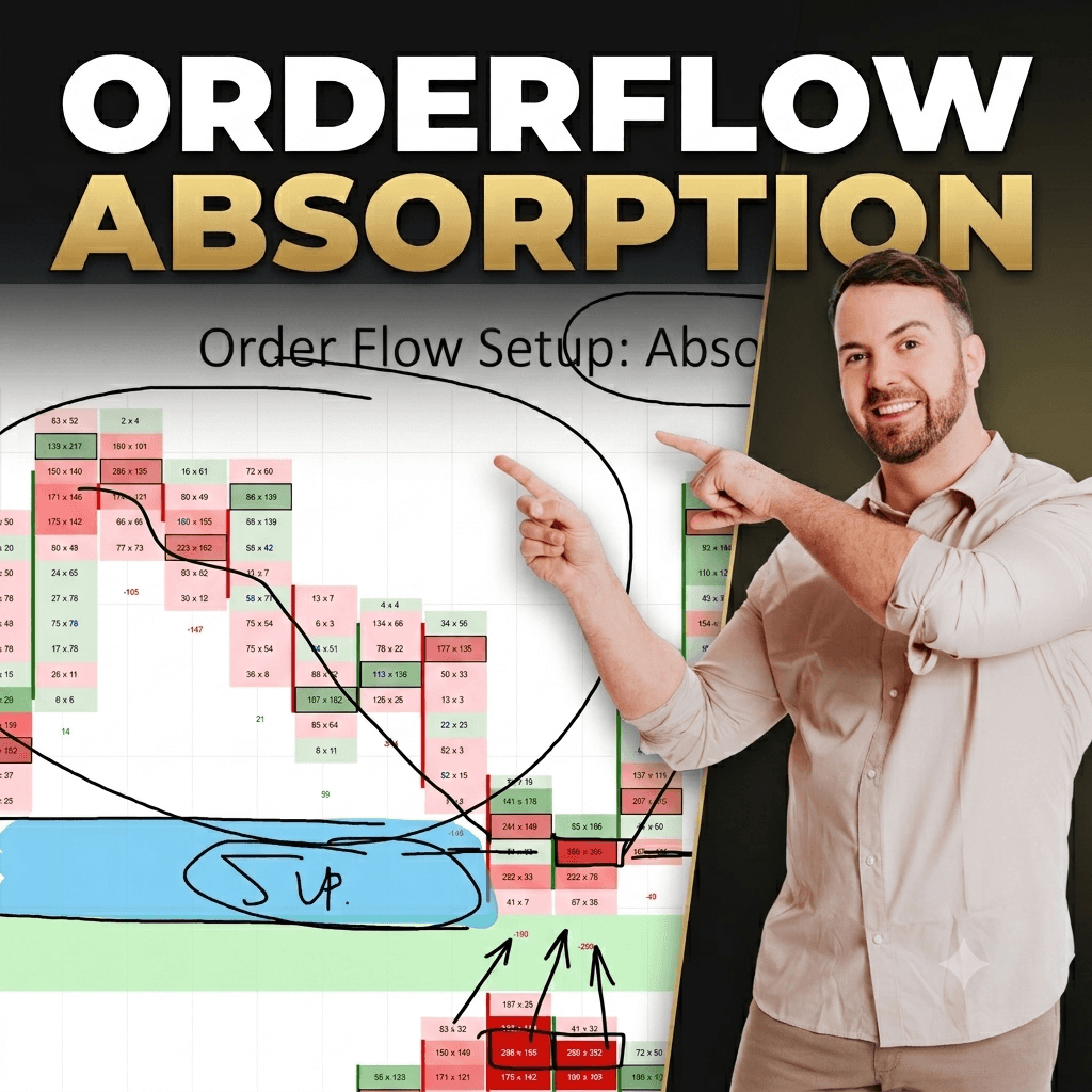
Every trader wants a way to confirm an entry before pulling the trigger. This is exactly why the order flow absorption setup has become one of Dale’s favorite tools. In simple terms, absorption happens when large orders quietly soak up buying or selling pressure at a key price level. This activity shows up clearly on a footprint chart. Once you learn to read it, you stop guessing whether a support or resistance zone will hold. Instead, you start seeing the actual footprints left behind by big players.
In this article, you will learn what absorption looks like. You will learn why it only matters at certain price levels. You will also learn how to compare volume so you can spot the difference between normal activity and a real signal. Dale studies this pattern on the 5 minute and 30 minute charts, and this guide breaks his approach into simple steps. You do not need any prior footprint experience to follow along.
By the end of this guide, you will be able to spot a heavy volume cluster and know right away if it matters. We will walk through three real examples so the pattern becomes second nature. You will also find a quick reference table and answers to common questions about this setup.
Table of Contents
Quick Summary
- The order flow absorption setup happens when unusually heavy volume trades on both the bid and the ask at the same time.
- It only means something when it appears at a support or resistance zone, not at a random spot on the chart.
- When buying pressure is absorbed, sellers take over and price moves down.
- When selling pressure is absorbed, buyers take over and price moves up.
- Always compare the volume to nearby cells to confirm it is truly unusual.
What Is the Order Flow Absorption Setup?
The order flow absorption setup is built around one simple idea. You watch what happens when unusually heavy volume trades on both the bid and the ask at the same moment. When this happens, it means buying or selling pressure is being absorbed by the other side of the market. Nothing here requires advanced math. That is part of why it works so well for traders at any level.
The Tug of War Analogy
Think of it like a tug of war between two teams. One side pulls hard, pushing price in one direction. The other side quietly absorbs every pull without giving ground. Eventually the pulling side gets tired. The other side takes control and pushes price the other way. This is exactly what happens inside the order book during absorption. Large buy orders and large sell orders are fighting for control of price.
Dale usually studies this pattern on a 5 minute chart, though it can also appear on a 30 minute chart. The core logic stays the same across both timeframes. You are always looking for the same footprint. That footprint is heavy activity on both sides of the order book, appearing together, at the same price, and standing out from everything nearby.
Why This Matters More Than a Regular Price Chart
Absorption tells you something a simple price chart cannot. A candlestick chart shows where price went. It does not show the fight happening underneath. Order flow gives you a look under the hood. It reveals whether buyers or sellers are running out of energy before price even turns. Many traders rely only on candle shapes or trendlines. Those tools have value, but they leave out this deeper layer of information.
There are two versions of this setup. Buying absorption happens when heavy buying gets absorbed by sellers, and price usually falls. Selling absorption happens when heavy selling gets absorbed by buyers, and price usually rises. Both follow the same footprint logic. The only difference is which side runs out of fuel first. Once you recognize one version, you will recognize the other, since they are mirror images of each other.
How Absorption Shows Up on the Bid and Ask
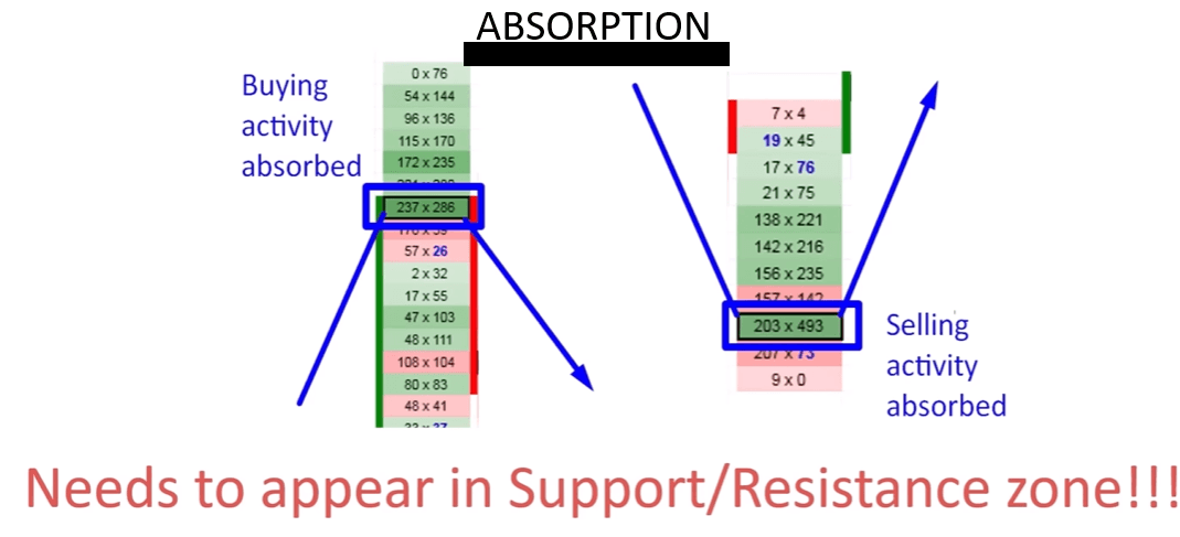
To spot the order flow absorption setup, you need to know exactly what to look for in the numbers. Absorption shows up as a cell, or a cluster of cells, where volume on the bid and volume on the ask are both far larger than anything happening nearby.
Watching Absorption at Resistance
Here is the logic Dale follows when price climbs and hits resistance. Price pushes upward, and buyers are in control. Momentum looks strong. Then, right at the resistance zone, something changes. Volume spikes on both the bid and the ask at the same time. This tells you sellers have shown up in force and are absorbing the buying pressure. Buyers eventually run out of fuel. Sellers take control, and price reverses downward.
Watching Absorption at Support
The same logic applies in reverse at a support zone. Sellers push price down, but at the support level, volume spikes on both sides again. This means buyers are absorbing the selling pressure. Once sellers run out of fuel, buyers take full control. Price reverses upward from the zone. Watching this pattern repeat across many charts builds real confidence in reading order flow.
Why Both Sides Must Show Heavy Volume
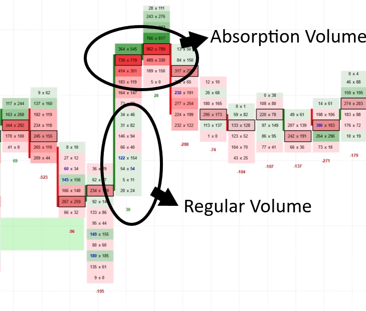
The heavy volume must appear on both the bid and the ask together. A spike on only one side is not absorption. That is simply one sided aggression, and it does not carry the same weight. Two sided volume tells you a real fight is happening at that price. It is not just a temporary rush of orders in one direction.
Absorption rarely happens in a single, isolated cell. It is more common to see it spread across several cells near the same zone. This is normal and should not make you doubt the signal. As long as the overall zone shows unusually heavy two sided volume, it still counts as a valid reading.
Why Absorption Only Works at Support or Resistance
This is the most important rule of the order flow absorption setup, and it is the rule most beginners skip. Absorption only means something when it happens inside a support or resistance zone. A heavy volume cluster sitting in the middle of nowhere confirms nothing. Trading off it alone is a common mistake.
Zones, Not Single Lines
Support and resistance are never a single exact line on a chart. They are always zones, sometimes spanning several ticks of price. Absorption needs to happen somewhere inside that broader zone. It does not need to hit one precise pixel on your screen. Traders who draw support and resistance as thin lines often miss valid signals for this exact reason.
Choosing How You Define Your Zone
You are free to build your zones however you prefer. Some traders use Volume Profile, looking for high volume nodes. Others prefer price action, watching old swing highs and lows. Some use VWAP as a dynamic level. Others use Fibonacci retracements. The method you choose does not change how absorption works once price arrives there.
Here is a simple way to think about it. Absorption is the confirmation. Your support or resistance zone is the setup. You need both pieces working together for the signal to carry weight. The zone tells you where the market might turn. The absorption tells you that big players are stepping in to make that turn happen. Neither piece is enough alone, but combined, they give you a much stronger reason to enter a trade.
This is also why patience matters with this strategy. You cannot chase absorption wherever it appears. Wait for price to reach a zone you already identified as significant. Only then should you start watching the footprint for that two sided volume spike.
Example One: Absorption at a Resistance Zone
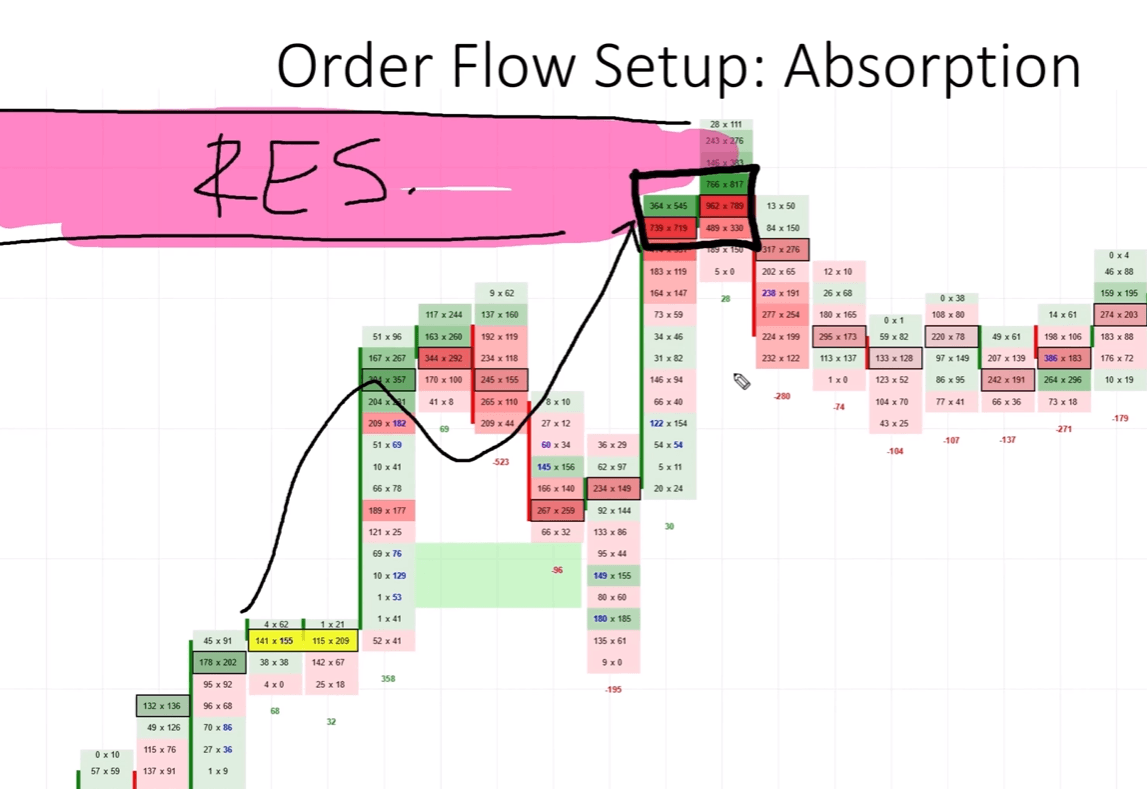
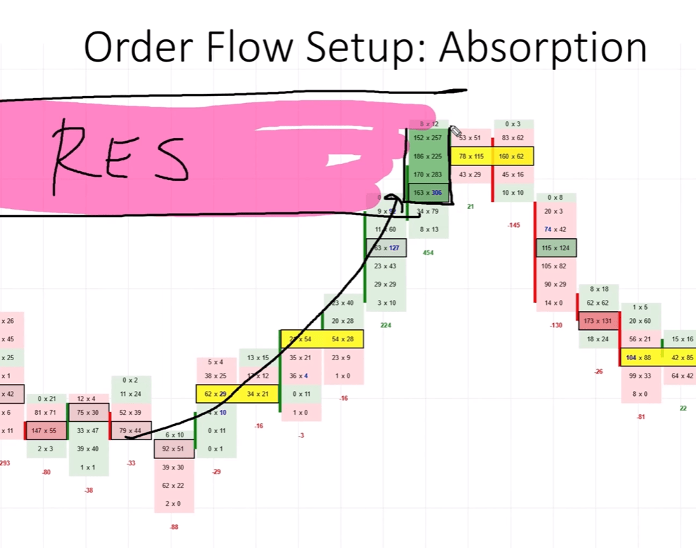
Let us walk through the first real example. Imagine price has been climbing steadily toward a resistance zone you identified earlier. As price reaches this area, you notice something unusual in the footprint. Volume on the bid and ask both jump sharply compared to everything around them.
In this case, the footprint shows 962 contracts on the bid and 789 contracts on the ask, clustered right at the resistance zone. Scanning the surrounding cells for comparison, nothing close to those numbers appears anywhere nearby. This gap between the absorption cell and its neighbors is what makes the signal valid.
Buyers were pushing price higher, but sellers stepped in at resistance and absorbed that pressure. Buyers ran out of fuel, sellers took control, and price turned downward. This is a textbook buying absorption signal. It gave strong confirmation that the resistance zone would hold.
Location | Bid Volume | Ask Volume | Nearby Average | Signal |
Resistance Zone | 962 | 789 | Far lower | Buying absorbed, expect reversal down |
Example Two: A Second Look at Resistance Absorption
The second example follows the same order flow absorption setup logic at a different resistance zone. This shows how consistent the pattern really is. Price climbs into a wide resistance area, and once again, unusually heavy volume appears on both the bid and the ask.
Comparing this heavy volume block against nearby cells, the difference is obvious at a glance. Nothing nearby comes close to matching it. This tells you sellers have arrived at resistance in force and are absorbing everything buyers are throwing at the market.
Just like the first example, buyers run out of fuel, sellers take control, and this becomes a signal to consider going short. This reinforces the idea that the pattern repeats. It is not a one time coincidence. The same footprint behavior shows up again and again at genuine resistance zones. That is why Dale treats it as a confirmation tool rather than a standalone signal.
Resistance zones can sometimes take more than one attempt to fully confirm. Price might tap a zone, show a smaller absorption signature, then pull back slightly. It may then return and show an even clearer reading before finally reversing. Watching the footprint across multiple visits to a zone builds extra confidence before you commit to a trade.
Example Three: Absorption at a Support Zone
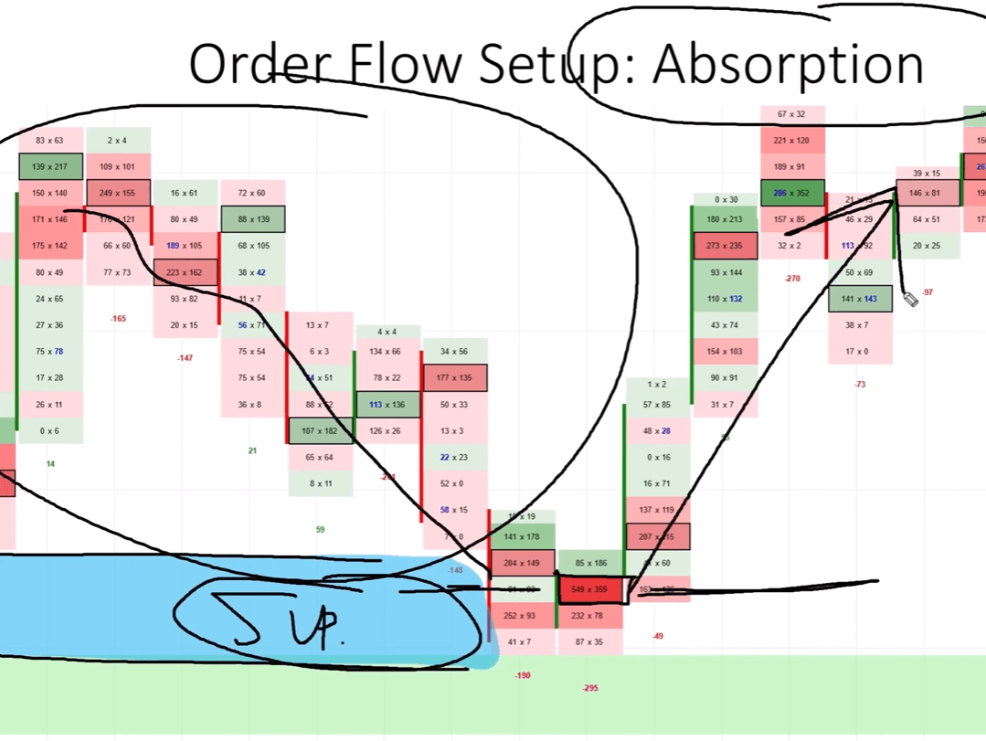
The third example flips the pattern around. It shows what selling absorption looks like at a support zone. Price has been falling and reaches a support area, which could be based on Volume Profile, price action, or any method you prefer.
Reading the Numbers at Support
As price touches this support zone, unusually heavy volume appears again. This time it shows 549 contracts on the bid and 359 contracts on the ask. Comparing this cell to the surrounding activity, it clearly stands out, just like the resistance examples did earlier.
Sellers were pushing price lower, but buyers stepped in at the support zone and absorbed that selling pressure. Buyers were willing to buy everything sellers had to offer. Sellers ran out of fuel, buyers took full control, and price reversed upward. This gave a strong signal to consider a long trade from that level.
Location | Bid Volume | Ask Volume | Nearby Average | Signal |
Support Zone | 549 | 359 | Far lower | Selling absorbed, expect reversal up |
Smaller Numbers Can Still Count
Notice that these numbers are smaller than the resistance examples. Absorption does not need a specific fixed number of contracts to count as valid. What matters is the comparison to nearby volume, not the raw size of the number. A cluster of 549 and 359 can be just as meaningful as 962 and 789, depending on what is typical for that instrument.
How to Tell If Volume Is Really Unusually Huge
Traders often ask how to know when volume counts as unusually huge. There is no single fixed number for every chart or instrument. Relying on a hard rule would actually work against you.
Compare, Do Not Guess
The approach that works is comparison. Look at the cell you are interested in, then scan the cells around it. Ask yourself if anything nearby comes close to matching that volume. If nothing does, you are likely looking at genuine absorption rather than ordinary noise.
This works because volume behavior is relative to each market. A contract that normally trades a few hundred per cell will show absorption at different numbers than one that trades thousands. What matters is the relationship between the cell and its neighbors, not the raw size of the number.
Building the Skill Over Time
A simple way to practice is to scroll back through your charts. Mark every place where a cell clearly stands out from everything around it. Over time, you will develop a feel for what looks unusual on the markets you trade. This kind of pattern recognition builds naturally the more charts you study.
Always check that this unusual volume is happening inside a support or resistance zone. Unusual volume without a meaningful level nearby is just noise. It should not be treated as a trade signal on its own.
Final Thoughts
The order flow absorption setup gives traders a way to look beneath the surface of a price chart. It reveals the actual fight happening between buyers and sellers in real time. By watching for unusually heavy volume on both the bid and the ask together, you gain insight that a simple candlestick chart cannot provide.
The three examples covered here, two at resistance and one at support, all follow the same logic. Heavy two sided volume shows up at a meaningful zone. One side of the market runs out of fuel, and the other side takes control. Once you learn to recognize this pattern, it becomes much easier to confirm your entries with confidence, instead of guessing whether a level will hold.
Remember the two rules that make this setup work. First, the volume needs to be genuinely unusual compared to everything happening nearby. Second, it must occur inside a real support or resistance zone, however you choose to define it. Skip either rule, and the signal loses much of its value.
Frequently Asked Questions
Does the order flow absorption setup work on every timeframe?
Dale mainly uses the 5 minute chart for this setup, though it also works on the 30 minute chart. The core logic stays the same across both, so choose whichever fits your style.
Can absorption appear across multiple footprint cells instead of just one?
Yes, this is actually more common than seeing it in a single cell. As long as the zone shows unusually heavy two sided volume, it still counts as a valid absorption signal.
What happens if I see heavy volume but it is not near support or resistance?
That volume does not confirm anything on its own. Absorption only becomes meaningful when it happens inside a genuine support or resistance zone.
Ready to Go Deeper?
Head over to trader-dale.com and click the Trading Course and Tools button. You will find the complete order flow pack there, along with custom built software and full training. You can also bundle it with other courses at a discounted price. Also apply the coupon code KEVIN10 to get an extra 10% discount on any purchase.
Start practicing this setup on your own charts today, and watch how much clearer your entries become.
