After 16 years in the markets, I’ve tested pretty much every indicator that exists — from the classics like RSI and MACD, to high-end institutional tools like Volume Profile and Order Flow. Most of them are a waste of time. A few are genuinely useful. And a small number are what I’d consider professional-grade.
In this article, I’m going to rank them honestly. Not based on what’s popular on YouTube or what the trading forums recommend — based on whether they actually give you an edge or just clutter your charts.
I’ve put them into a tier list: D-Tier (complete garbage), C-Tier (limited but not useless), B-Tier (good for context), A-Tier (professional tools), and S-Tier. You’ll understand S-Tier when you get there.
Table of Contents
The Trap of the "Holy Grail" Strategy
When most people start trading, the advice they get is: “add an indicator to confirm your entry.” So you add one. Then another. Then a few more. Before long, your chart has five indicators, all contradicting each other, and you can barely see the price candles underneath.
I went through this phase myself. I genuinely believed that if I found the right combination of math formulas, the market would start making sense. I spent months tweaking RSI periods, trying different MACD settings, backtesting moving average crossovers.
Here’s what I eventually figured out: the market isn’t a math problem. It’s an auction. The price goes where large institutions push it based on their orders. Most retail indicators only show you where price was — they tell you nothing about where the real money is moving. That’s the fundamental problem.
The Indicator Rankings at a Glance
Tier
Tool
Why It’s Ranked Here
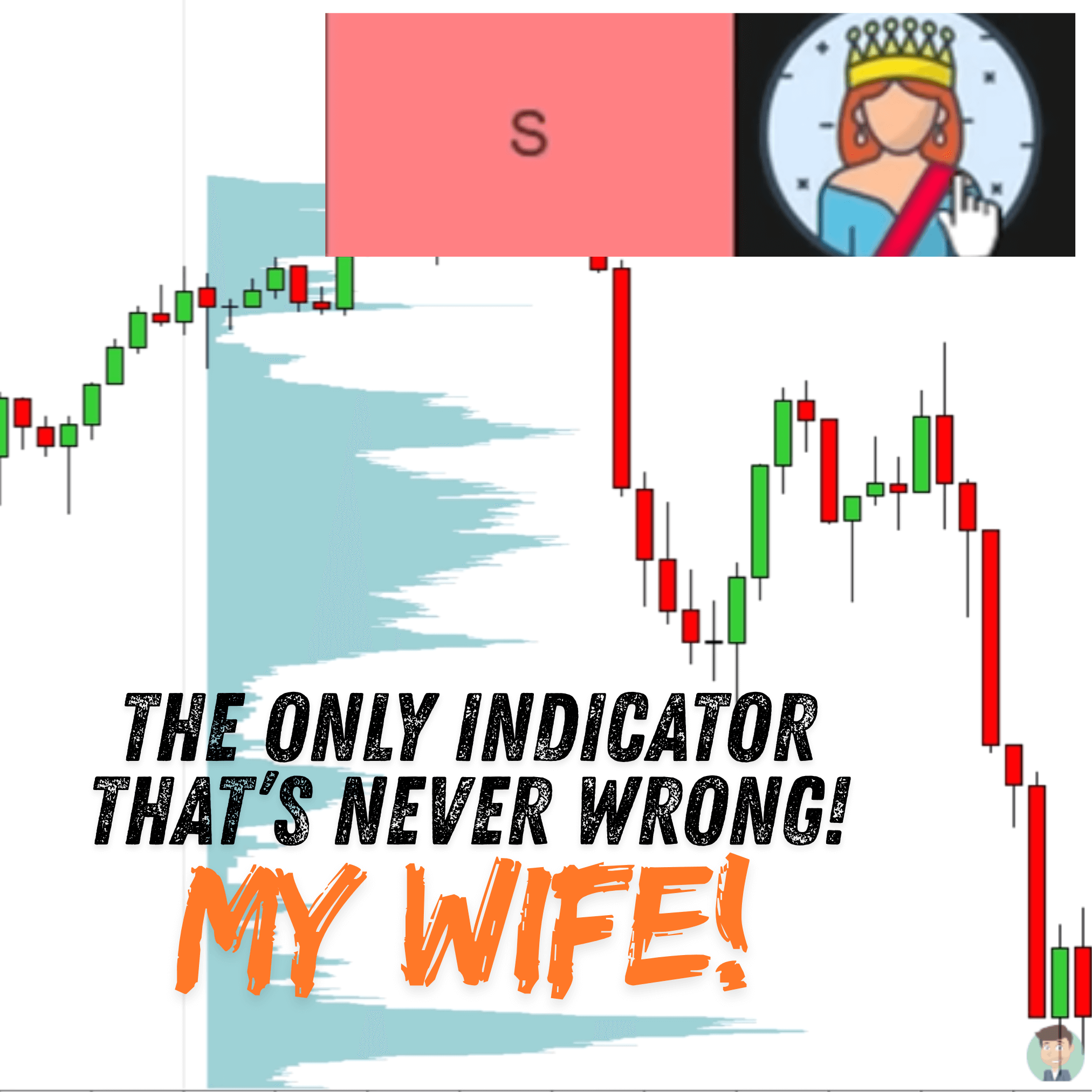
S-Tier
Your Wife
The only thing with 100% accuracy.
A-Tier
Volume Profile, Order Flow
Tracks real institutional money and executed orders.
B-Tier
VWAP, Fair Value Gap
Provides institutional context and “fair value” logic.
C-Tier
EMA, SMA, Bollinger Bands
Useful for basic trends but fails in sideways markets.
D-Tier
RSI, MACD, Stochastics
Complete garbage. Lagging math with no predictive power.
D-Tier: Why You Should Avoid RSI and MACD

D-Tier tools are what I call “random signal generators.” They’re lagging, they’re price-only, and they’re the reason most retail traders lose money. If these are on your chart, remove them. Here’s why each one fails:
The RSI Disaster
The Relative Strength Index (RSI) is supposed to tell you when a market is “overbought” or “oversold.” However, in a strong trend, the RSI will stay at 80 (overbought) while the price continues to climb for hundreds of pips. If you sell because the RSI says so, you will get run over.
The Lagging MACD
The MACD is simply two moving averages subtracted from each other. Because it relies on averages, it is incredibly slow. By the time the MACD gives you a “crossover” signal, the move is usually already over. It signals “long” at the top and “short” at the bottom.
Stochastics: The Fake Reversal King
Stochastics is even worse because it is too fast. Every tiny price wiggle looks like a reversal signal. In a trending market, it is a recipe for a series of small, frustrating losses.
C-Tier: Understanding Averages and Bollinger Bands

C-Tier tools aren’t garbage — they’re just severely limited. They’re context-blind, meaning they can’t tell the difference between a trending market and a ranging one. Use them in the wrong environment and they’ll generate false signals constantly.
- Moving Averages (EMA/SMA): An EMA reacts faster than an SMA, which makes it marginally better. But both fail you when the market moves sideways — and the market is sideways a lot of the time.
- Bollinger Bands: They show volatility reasonably well but generate too many false reversal signals when a trend is strong. The band expansions and contractions can be useful as a volatility filter, but nothing more.
- Vertical Volume (time-based): This shows you when lots of contracts traded, but not at what price. You can see a volume spike but have no idea whether it’s institutional accumulation at a support level or just news-driven noise.
B-Tier: The Best Trading Indicators for Context
B-Tier tools actually incorporate logic. They’re not just price averages — they use volume weighting or price structure to give you meaningful context about where the market is and why. These belong on professional charts.
VWAP (Volume Weighted Average Price)
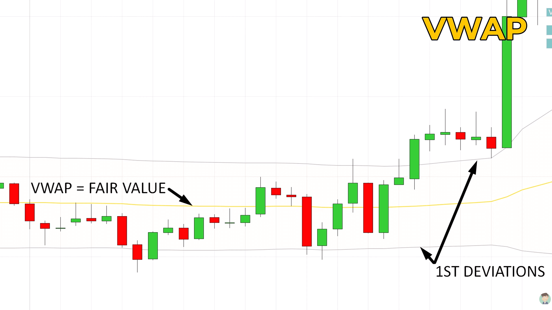
VWAP is the most important average in the market, full stop. Unlike a moving average that weights every time period equally, VWAP gives more weight to price levels where the most volume occurred. That makes it a true reflection of where the market has been trading on average — not just where it happened to be at any given minute.
Why do institutions care about VWAP? Because large fund managers are often measured against it. If a bank needs to buy a large position, executing “below VWAP” is considered a good fill — they paid less than the average price. This creates real institutional interest around VWAP levels, which is why it works as dynamic support and resistance.
I use VWAP with its standard deviation bands for the Rotation and Trend setups I cover in my VWAP guide. The deviation bands tell you immediately whether you’re in a rotation or a trend — which determines your entire trading approach for that session.
Fair Value Gaps (FVG)

A Fair Value Gap (FVG) is created when price moves aggressively in one direction and leaves an imbalance — a zone where only one side of the market (buyers or sellers) was present. On a candle chart, it appears as the space between the wick of the first candle and the wick of the third candle, untouched by the middle candle.
Why does price return to fill these gaps? Because the market is an auction seeking balance. When price moves too fast, orders from the other side didn’t get filled. The market tends to return to those zones to offer the opposing side a chance to transact.
FVGs rank in B-Tier because they have real logic behind them — they’re structural, not mathematical. They become significantly more powerful when they align with a high-volume node from your Volume Profile. When a gap zone coincides with where institutions built positions, you have a genuinely high-confidence entry.
A-Tier: Professional Tools (Volume Profile & Order Flow)
This is where professional tools live. A-Tier indicators don’t tell you what price did — they show you what the big players actually did with their money. That’s the difference that matters.
Volume Profile
Volume Profile is the most powerful trading tool I know. Instead of showing you volume by time (like a vertical volume histogram at the bottom of your chart), it shows you volume by price — a horizontal profile on the side of your chart that tells you exactly how much was traded at each price level.
The highest-volume node — the Point of Control (POC) — is where the most money traded during a given period. That level acts like a magnet for price because it’s where institutions built their positions. When price returns to that level, those same players often step back in to defend their position.
Volume Profile is the backbone of my entire trading methodology. If you want to understand it properly, I have a detailed guide on trading with Volume Profile and POC, and also a free Volume Profile book if you want to go deeper.

The key distinction: a standard volume histogram at the bottom of your chart tells you when lots of people were trading. Volume Profile tells you at what price they were trading. Time doesn’t move markets — orders do. So the price-based view is far more meaningful.
- High Volume Nodes (HVN): Wide bars on the profile. These are your strongest support and resistance levels — where institutions spent the most time building positions. Price gets drawn back to these zones repeatedly.
- Low Volume Nodes (LVN): Narrow bars. Price moved too fast here for anyone to do much. In a trending market, price typically “zips” through these gaps quickly.
- Point of Control (POC): The single highest-volume level in the profile. The strongest single reference point on your chart.
Order Flow
Order Flow is the closest thing to reading the market’s live pulse. It shows you the actual buy and sell orders executing inside each candle — not lagged, not calculated, but real-time. You can see when a large buyer is absorbing selling pressure, when a massive seller steps in to cap a rally, and when a trend is running out of fuel. It takes time to learn, but it’s the most direct view of institutional activity available.

If Volume Profile is your map of where institutional activity happened, Order Flow is your microscope showing what’s happening right now, inside each candle.
Order Flow — specifically footprint charts — shows you the actual buy and sell orders being executed at each price level. You can see when a large buyer is absorbing selling pressure, when a big sell order steps in to cap a rally, or when buyers are running out of momentum. This is the closest thing to reading the actual activity of institutional players in real time.
The main concepts to learn:
- Delta: The difference between buy-side and sell-side volume. Positive delta in a bullish candle with price advancing confirms the move. Negative delta at a support level is a warning sign.
- Absorption: Large buy orders hitting the market but price not moving higher — means a big seller is absorbing the demand. A major clue that a level will fail.
- Exhaustion: Progressively smaller order sizes inside a trending candle sequence — the fuel for the move is running out.
Order Flow has a learning curve. But after 16 years I’d rather spend six months properly learning it than another six years hoping RSI gives me an edge.
S-Tier: The Only Indicator That Is Always Right

People often ask why I leave S-Tier empty when it comes to software. The honest answer: no tool is 100% accurate, and any indicator that claims to be is lying to you. Markets are dynamic — human emotion, unexpected news events, central bank decisions — no formula captures all of that.
That said, there is one indicator in my life that has a perfect track record: my wife. Whether it’s about the market direction, the weather, or what’s for dinner — she’s never wrong. Unfortunately, she hasn’t built a plugin for NinjaTrader yet, so in the meantime we rely on Volume Profile and Order Flow to do the heavy lifting.
Conclusion: Building Your Professional Toolkit
The framework is simple: delete the D-Tier, understand the B-Tier, and execute with the A-Tier.
Stop using indicators that only look at price history and don’t tell you anything about what the big players are doing. Add tools that track actual volume and order flow. Your charts will look cleaner, your levels will be more precise, and your entries will be based on real market data rather than lagging math formulas.
If you’re ready to go deeper on the A-Tier tools, start with my guide on reading Cumulative Delta for price reversals — it bridges Volume Profile and Order Flow in a way that’s very applicable for intraday trading. And if you want to see how I apply Volume Profile in full detail, the Funded Trader Academy covers everything from entries to position management.
Frequently Asked Questions (FAQ)
Here are the questions I get asked most often about trading indicators:
A moving average tells you the average price over a period of time — it weights every bar equally regardless of how much volume traded there. Volume Profile tells you where the most money actually changed hands. Since large institutions execute their orders at specific price levels and then defend those positions, volume nodes reflect genuine market interest. A moving average is a calculation; a volume node is evidence of where real money entered the market.
I’d remove it from your trading charts. RSI can stay overbought for hundreds of pips in a strong trend — meaning it’ll signal “overbought” while price continues to climb. Shorting based on a high RSI reading in a trending market is one of the most reliable ways to get stopped out repeatedly. The one scenario where RSI has some limited value is extreme readings (above 90 or below 10) on very high timeframes, but even then you’d need additional context to act on it. Volume Profile gives you a much more direct read on whether a level will hold.
You can and should use tools from different tiers — but for different purposes. B-Tier tools (VWAP and Fair Value Gaps) are excellent for reading market context: is price at fair value or extended? Is there an imbalance nearby? A-Tier tools (Volume Profile and Order Flow) are for executing: finding your exact level and confirming whether the big players are stepping in. The mistake most traders make isn’t using multiple tools — it’s using D-Tier tools alongside A-Tier tools and then wondering why their signals conflict. Clean out the D-Tier completely. Then B and A work together well.
Mostly inertia and familiarity. RSI and MACD have been in every trading textbook for decades. Brokers include them by default. YouTube tutorials are full of them because they’re easy to explain visually. But “easy to explain” and “actually gives you an edge” are different things. The harsh reality is that the retail trading industry has a financial incentive to keep you using simple, free, platform-default indicators — because the moment you move to professional tools like Volume Profile and Order Flow, you start needing specialised platforms and education, not just a free charting app. The popularity of D-Tier tools is largely a legacy of how trading education got commoditised, not evidence that they work.
It might mean you’ve been trading in trending conditions where a moving average happens to keep you on the right side of the market. Moving averages perform reasonably in strong, clean trends — the problem is they give you no warning when the trend ends or when the market flips to a sideways rotation. When that happens, they generate crossover signals repeatedly while price chops back and forth, each one a small loss. The question isn’t whether a moving average has produced winning trades for you — it’s whether you’d have found those same trades with better tools, with cleaner entries and fewer losing ones in between. My view after 16 years: probably yes.
Volume Profile, without hesitation. It teaches you to read the market structurally — where the big players built positions, which levels have real significance, and why support and resistance actually forms where it does. Once you understand Volume Profile, everything else makes more sense: why VWAP matters (it’s a benchmark for institutional execution), why Order Flow is powerful (it shows those same institutions acting in real time). If you start with RSI or MACD, you’re learning a language that doesn’t connect to anything fundamental. Start with Volume Profile and you’re building on a foundation that scales all the way to professional trading.
Volume Profile is enough to build a solid, profitable strategy on its own — and that’s what I’d recommend starting with. Order Flow adds a live confirmation layer: it tells you what’s happening right now at your Volume Profile level, rather than relying on historical evidence alone. The combination is powerful, but Order Flow has a genuine learning curve. Trying to learn both at the same time often leads to analysis paralysis. Get comfortable reading Volume Profile levels, trading pullbacks to volume clusters, and managing your risk first. Then add Order Flow as a confirmation tool once those fundamentals are locked in. Six months of Volume Profile alone will do more for your trading than six years of RSI with a bit of Order Flow sprinkled on top.